
By Victoria Stoklasa, CEO
One of the fun services that Bon Visto Media provides for clients is graphic design. We develop beautiful, engaging images for our clients’ prospective customers to click and share. One of the key elements of our graphic design is typography—the way the text looks in an image. As we’ve created images this past year, there were ten typefaces that we kept going back to. Here are our top ten fonts of 2014.
One of the fun services that Bon Visto Media provides for clients is graphic design. We develop beautiful, engaging images for our clients’ prospective customers to click and share. One of the key elements of our graphic design is typography—the way the text looks in an image. As we’ve created images this past year, there were ten typefaces that we kept going back to. Here are our top ten fonts of 2014.
10. Young & Beautiful

No, not the Lana del Rey song…although, this looks like how she would write. This script does have a youthful and feminine feel to it, making it great for communicating heartfelt messages.
9. ARB-218 Neon Blunt

The name of this font is awkward and unwieldy. But dude, look at how great it is. Most bold, black typefaces are too overwhelming, but the hollow stripe in the middle of each stroke gave the letters a much needed brightness. It’s almost jazzy!
8. Times New Roman

Don’t laugh—there’s a reason this font has become such a standard. Regardless of where we’ve put it, this simple, versatile serif typeface has always looked good. While a lot of fonts on this list are the typographic equivalent of infinity scarves and statement necklaces, Times New Roman is the white oxford shirt and black slacks.
7. Passion Tea
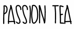
There’s been a lot of love in the past few years for what I like to call “Where the Wild Things Are” typefaces, and Passion Tea was quite popular at Bon Visto Media. The gentle curve of the letters made it stand out from most wiry handwritten types and gave it a little more whimsy. (The fact that it’s named after one of our favorite beverages helps, too.)
6. Biko

Does this look familiar? Why, it’s the same font that was used in creating the logo for Bon Visto Media! Okay, this entry on the list might be a bit of typographic nepotism, but we can’t help but love the geometric layout of the letters. It’s fresh while obviously referencing classic fonts, which makes it so appealing.
5. Anjelika Rose
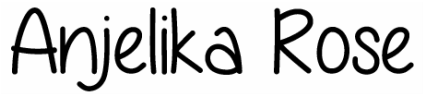
Everyone loves a good handwritten font. What we love about Anjelika Rose isn't just that it's cute and reminds us of a 13-year-old girl's science class notes--we love how readable it is. This works well in both the header AND the body of a piece of text.
4. Valentina
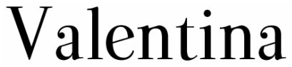
Every time I look at this typeface, it makes my heart flutter. Couldn’t you see this on the cover of a children’s fantasy picture book? The curl and upward turn of the serifs deliver a bit more charm and magic than you would expect from a typeface.
3. Thirsty Script
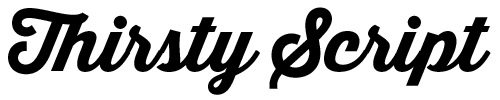
We saw this style of typeface EVERYWHERE! It wasn't just in our designs; it was everywhere else, too! And why wouldn’t it be? It’s feminine, clean, and pleasant. If you want to class up your design while still being contemporary, a bold script was the way to do it in 2014, and Thirsty Script was our favorite.
2. Bebas Neue

While most people say Helvetica is the best go-to font, we want to make a case for Bebes Neue. It has the versatility that all designers crave—this is the sort of typeface that looks good big or small, bold or thin. Plus, it's tall, lending it an air of masculinity.
1. Zantroke

This slab serif font is one of our favorite ways to make a statement. It’s bold without being overwhelming, and it’s structured while still allowing for the implication of movement and energy. It’s the perfect combination of elements to make it one of the most exciting typefaces we’ve had the pleasure of working with this year.
What were your favorite fonts of 2014? Did we leave off your favorite? Leave a comment and let us know!
What were your favorite fonts of 2014? Did we leave off your favorite? Leave a comment and let us know!
 RSS Feed
